
Overview.
| Role | UX Designer. UX Researcher |
| Duration | Aug 2018 - Dec 2018 |
| with Taylor Stillman. Fred Liu. Yannu Li | |
| Tag | Ambient Visualization. Smart Home |
| Tool | Sketch. Principle. InVision. |
What's the problem we try to solve?
Problem.
Users want to save energy but don’t want to compromise for comfort and expect an easier way.
Goal.
Provide actionable energy saving actions and positive feedback to motivate them to save energy.
Solution: Persuasive ambient visualization.
Unobtrusive.
Without obtrusive occupying the full attention, ambient viz is a calm technology which would personally involve the user when he or she wishes to do so.
Engaging.
Going beyond simply ‘informing’ people of specific data patterns, ambient viz evokes emotional engaging ways of data representation.
Persuasive.
Provide personalized messages at teachable moments, at the right time and right place.
Ambient viz is a calm technology and evokes emotional engaging ways of data representations.
Process summary.

Delve into the problem.
Methods we used.
Exploratory interview.
The goal is to look for target users and define user tasks.
Survey.
The goal is to get a whole picture of energy usage situations and identify existing problems, user expectations and motivations.
User interview.
The goal is to reconfirm motivations from the survey and get a narrative of user tasks.
Wrap up insights.
Went through all interview transcripts. Created affinity diagram, personas and task analysis to generate key themes.
User needs and design principles.

Iterations.
Visualization variations.
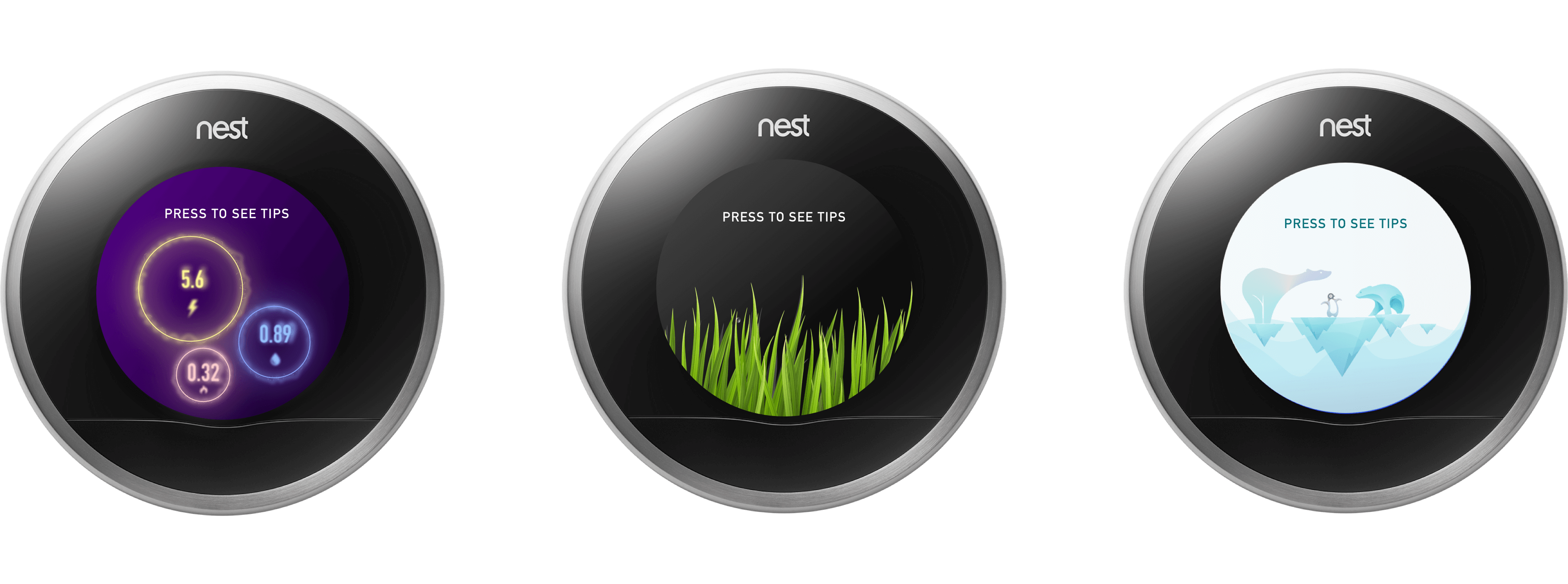
After the divergent and convergent brainstorming and concept feedback session, we finalized the idea of using visualization as a subtle way to enhance energy saving awareness. Following are three visualization variations. After casually talking to 10 users, we chose the second one because of the learnability.
Visual mapping is the key for visualization learnability.
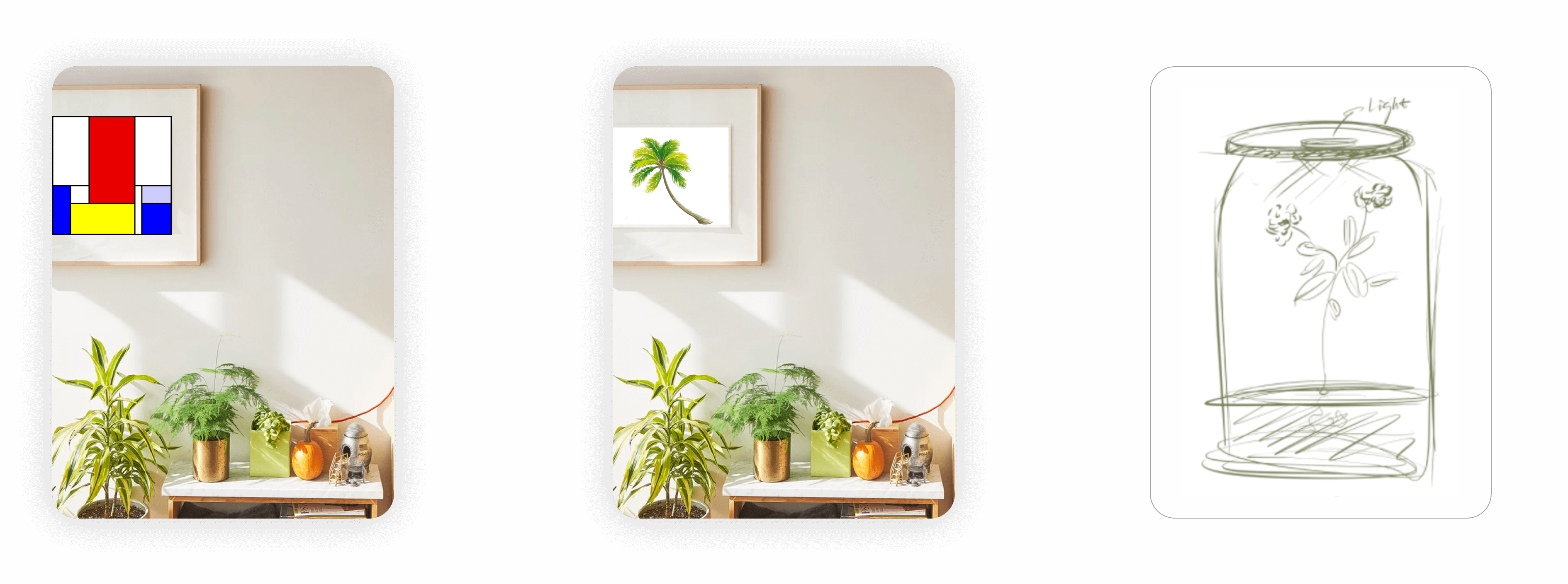
Mondrian’s painting.
An artist painting that maps some elements to energy data. E.g. Blue, red and yellow represents water, gas and electricity usage separately.
Pros: Aesthetically pleasing under home context.
Cons: Worried about the complexity of mapping.
Tree metaphor.
A metaphor that maps to energy data. E.g. Fewer the energy usage, denser the tree is.
Pros: The meaning of the metaphor relates to energy; mapping is simple.
Living plant.
A living plant whose health depended on a person’s energy saving behavior
Pros: A living entity may increase motivation
Cons: The status of a living plant may not be accurately affected by outside parameters.
From dynamic painting to smart home devices.
Initially our idea was to use dynamic painting on which energy data can be displayed and updated. From the concept feedback session, we found users want more interaction with the painting like being able to touch it to change views for informative energy information or to receive a real-time suggestion or notification. Moreover, users dont' want to spend too much money on a technology that was solely for energy saving and expect more automatic options. For example, the system could automatically change the temperature instead of making the user do it themselves.
Therefore, our goal becomes to find an existing smart home platform that we could integrate our visualization idea with.
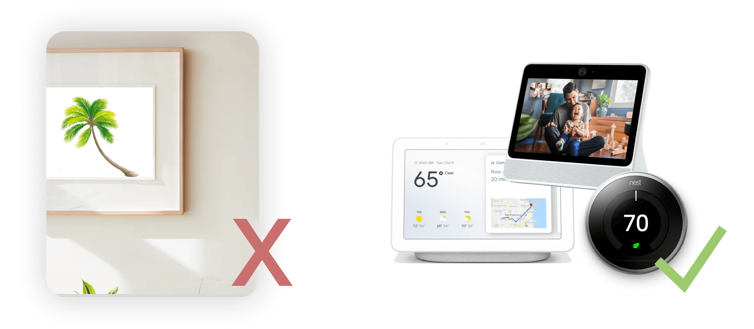
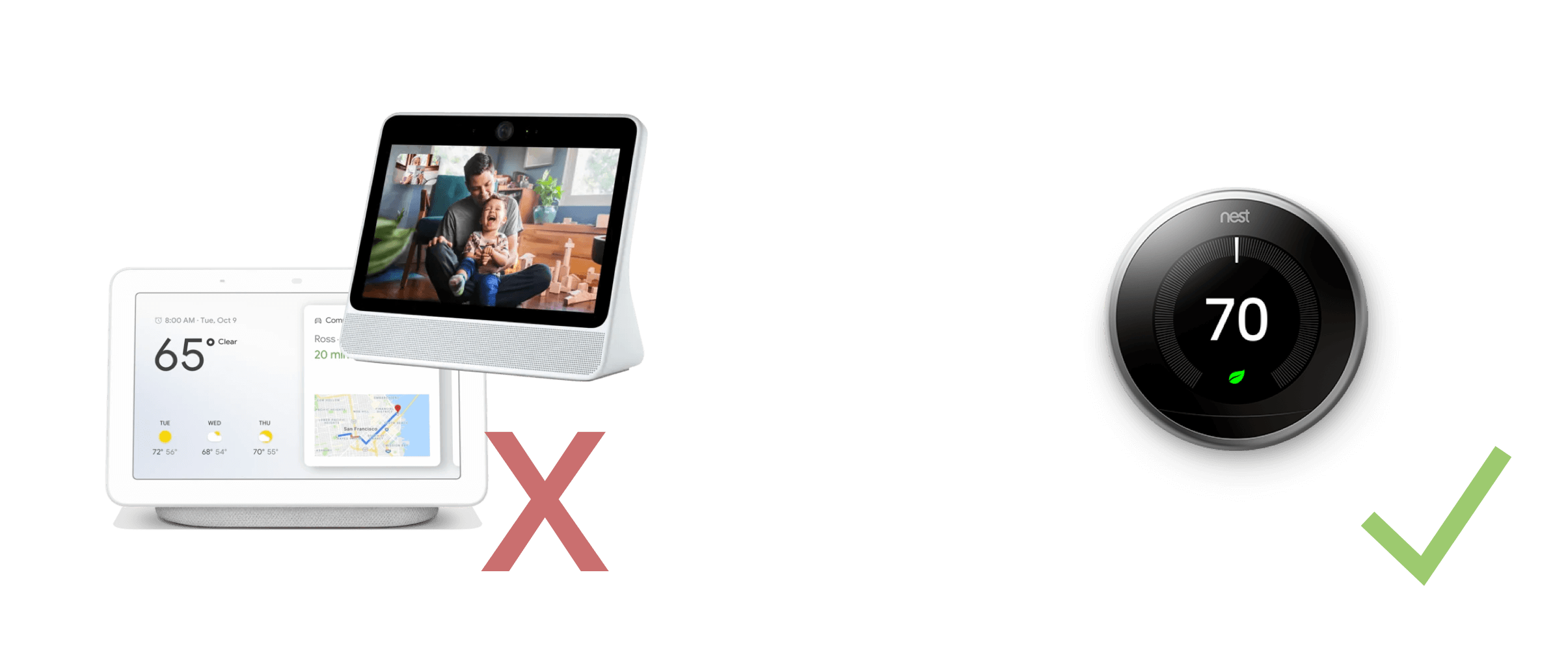
Google Hub? Facebook Portal? Or Nest?
For voice assistants with visual displays like Google Hub and Facebook Portal, users who have roommates express privacy concerns since not everyone shares these devices. In our preliminary research we found 5 in 6 interviewees owned a Nest thermostat device. And Nest serves as a single control of temperature regardless of whether with or without roommates.
Final design.
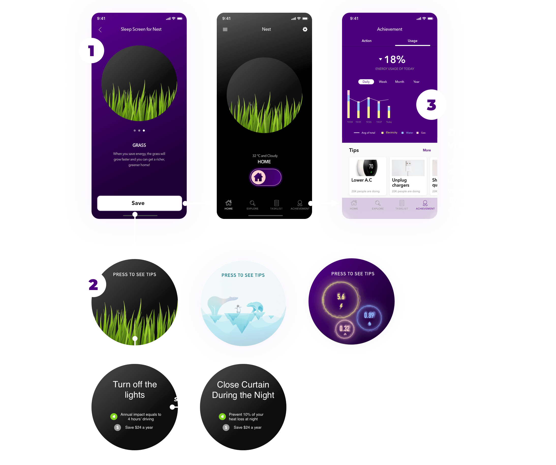
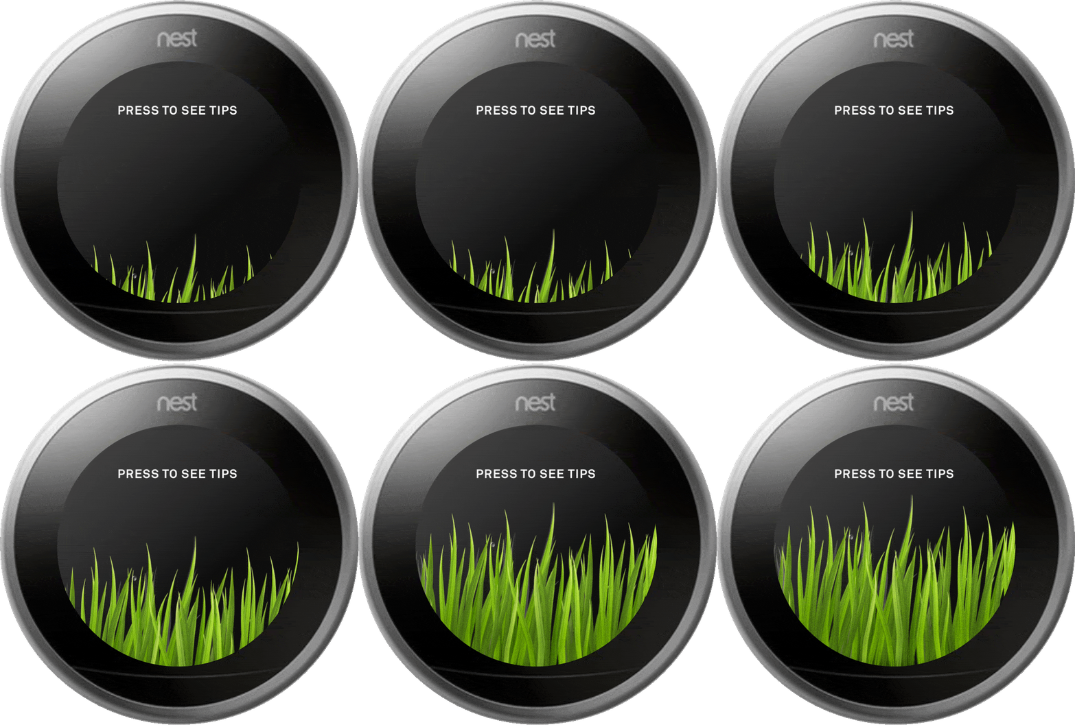
Ambient visualization to augment awareness and monitor energy usage.

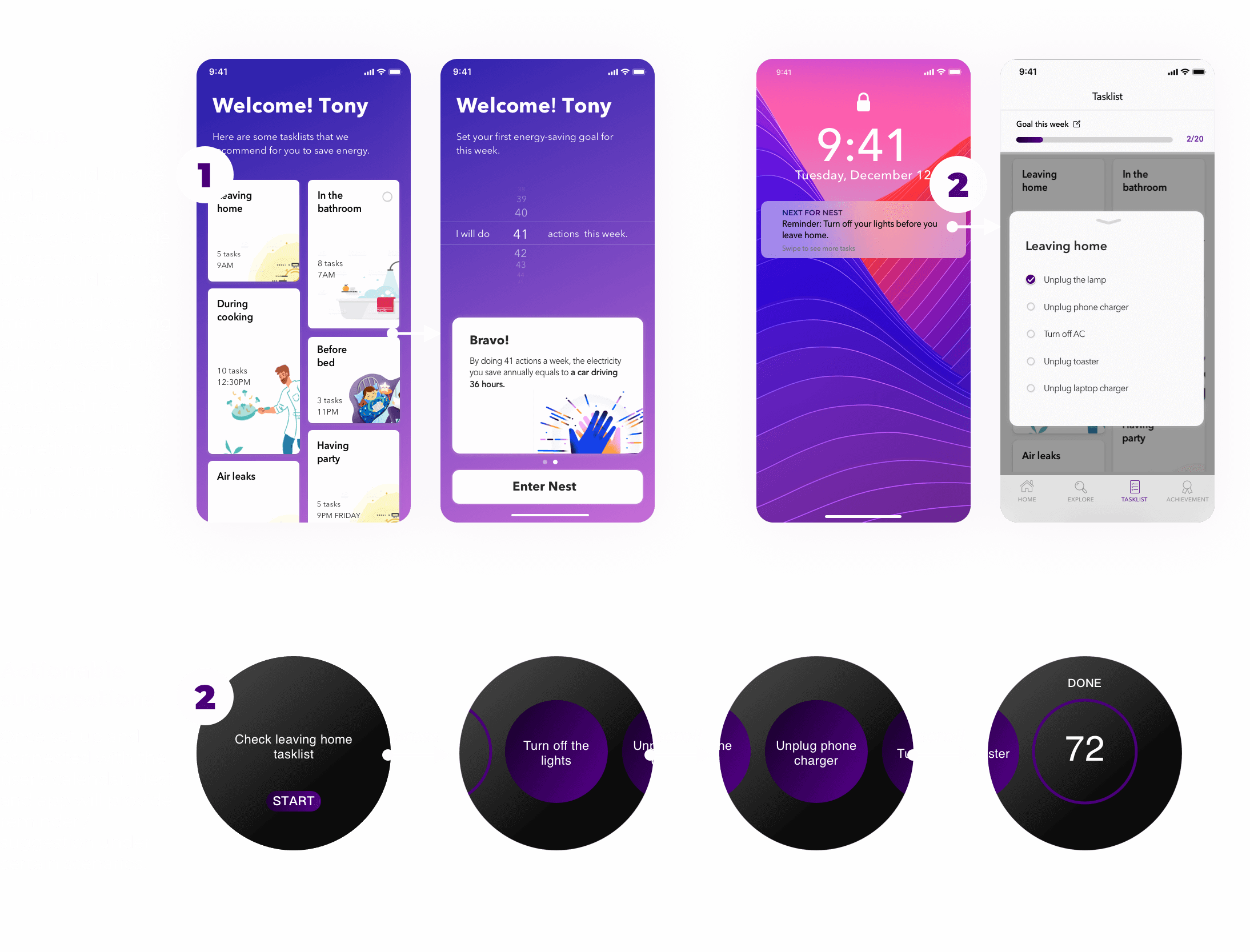
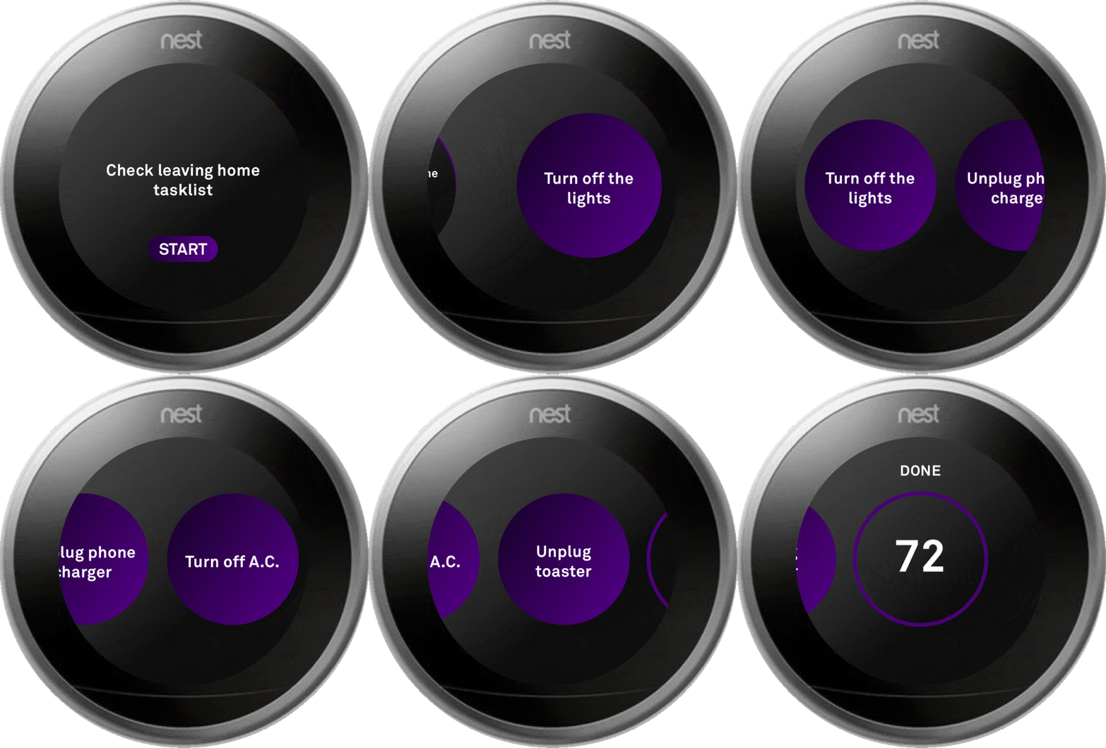
Actionable suggestions to encourage more informed decisions and positive behaviors.
