

Overview.
| Role | UX Designer. Developer. |
| with Tae Prasongpongchai. Benjamin Du Preez. McKenzie Murphy |
|
| mentored by John T. Stasko. | |
| Duration | Aug 2019 - Dec 2019 |
| Tag | Music Visualization. |
| Tool | D3.js. Spotify API. Amazon Web Services. Figma. Final Cut Pro. |
What's the problem we try to solve?
Music itself is inherently auditory. It’s easy for us to say that two music artists sound similar or different, but it’s difficult to pinpoint exactly how they differ and it’s hard to visualize such differences. So our goal is:
Understand.
Compare.
Discover.
Professor Stasko featured our project in his article and said it was one of "the two impressive projects from the fall"!
Delve into the problem.
Dataset.
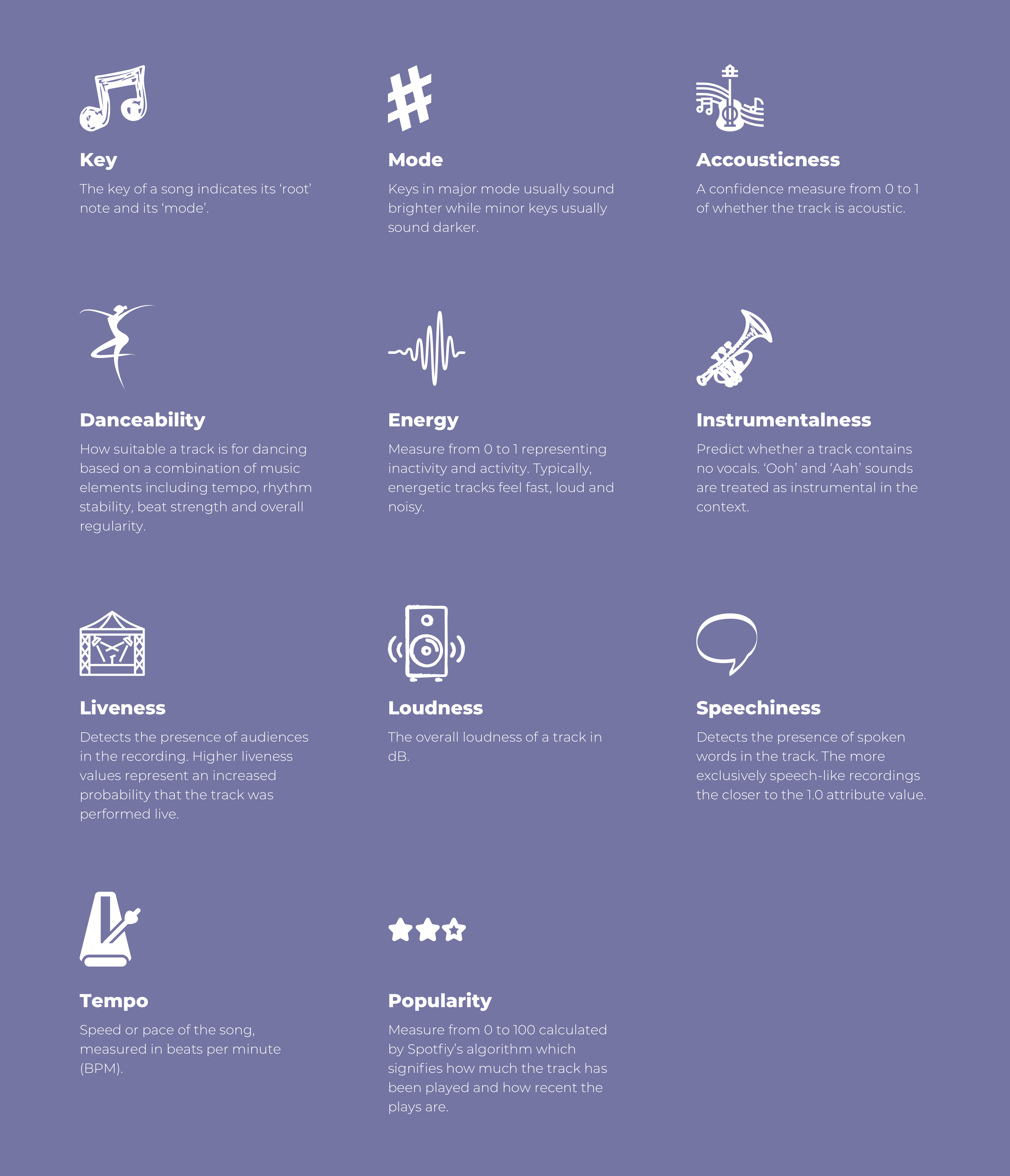
We started with Spotify API. Each song had 11 music features which served as the foundation. From that, we explored different visual representations like radial, linear scatter plots, histograms, star plot views to help users understand music features and recommended similar songs based on music features.
Design principles.
Interpretation.
Design should be easy to understand and avoid ambiguous or unexpected representation and interaction.
Graphical integrity.
Design should avoid misleading baseline error, scale error and put under the right context.
Delight.
Design should appeal to a broader audience and provide delightful experience for users to interact with instead of heavy engineering visualization.
Insight.
Design should spur and discover insightful questions and spread music knowledge informatively.
Iterations.
Methods we used.
Brainstorming and concepts.
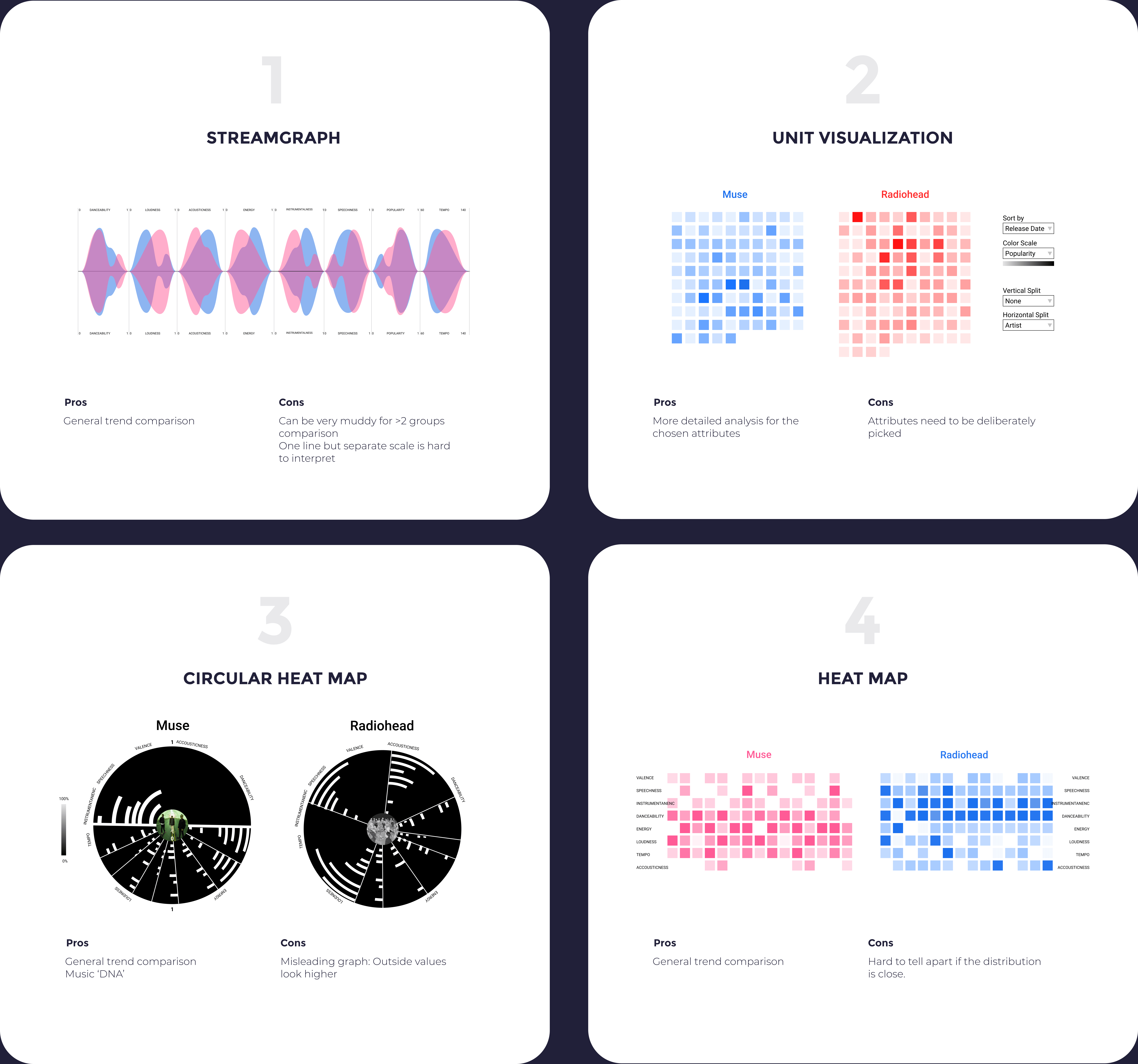
We conducted two rounds of brainstorming sessions to go really broad about what music features included and what visual representations were appropriate. Finally we converged to four key concepts.
Feedback and iterations.
We arranged meeting with Prof. Stasko and two TAs every two weeks to present what we’ve done so far and feedback they have. Based on the feedback, we iterated the feature, visual representations and interactions.
Coding and iterations.
Differ from normal websites, the purpose of visualization is to provide exploratory insights on datasets. Therefore, visualization websites include a large amount of data and the interface will be highly dynamic once data is displayed. For instance, if data is clustered in one place, there's a ‘hairball’ problem. We kept iterating the design while coding the website.
Deliverables.
We published our website and created an introduction video to present to the class.
Concepts
Convergent of concepts.
For concept 1, the uncontinuous scale is hard to interpret. While for concept 3, human perception for size equals to area and the outside values seem higher than inside ones. But at the same time, it represents more of a signature / DNA of a song and suitable for sharing.

Shneiderman's “information-seeking mantra”.
"Overview first, zoom and filter, then details on demand"
Overview first.
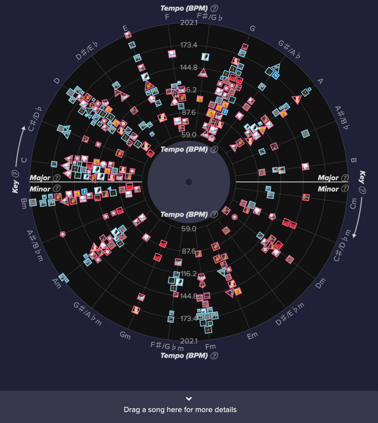
By default, all songs will be displayed in all views to visualize the general trend. More specifically, vinyl view shows the general relation between two selected music features and bar view displays general trend according to each music feature.
Zoom and filter.
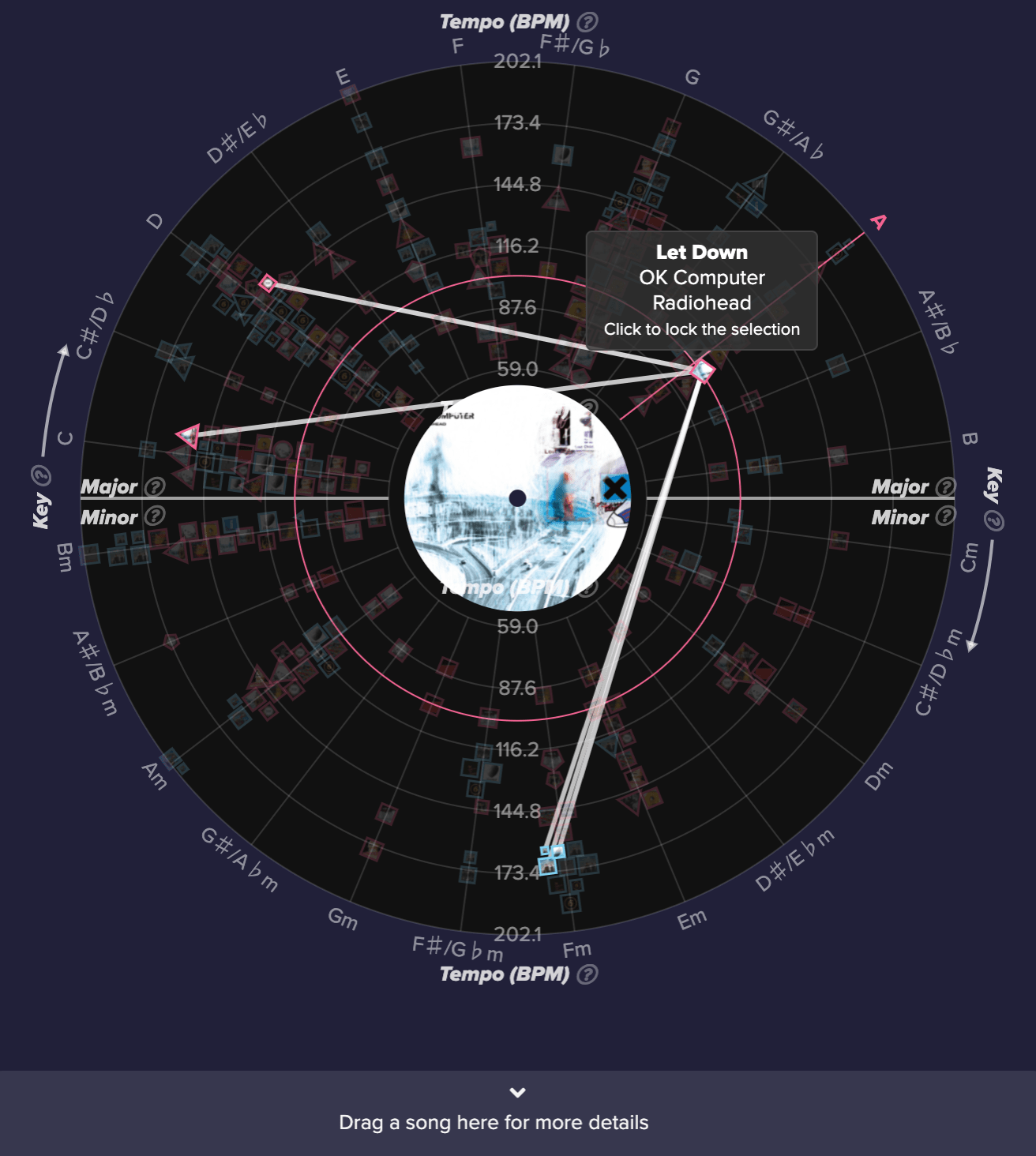
Users could hover any element in the view: one artist in the artist selection / one song in the vinyl view / one bar in the bar view. Once hovered, other views will be highlighted based on the selection.
Details on demand.
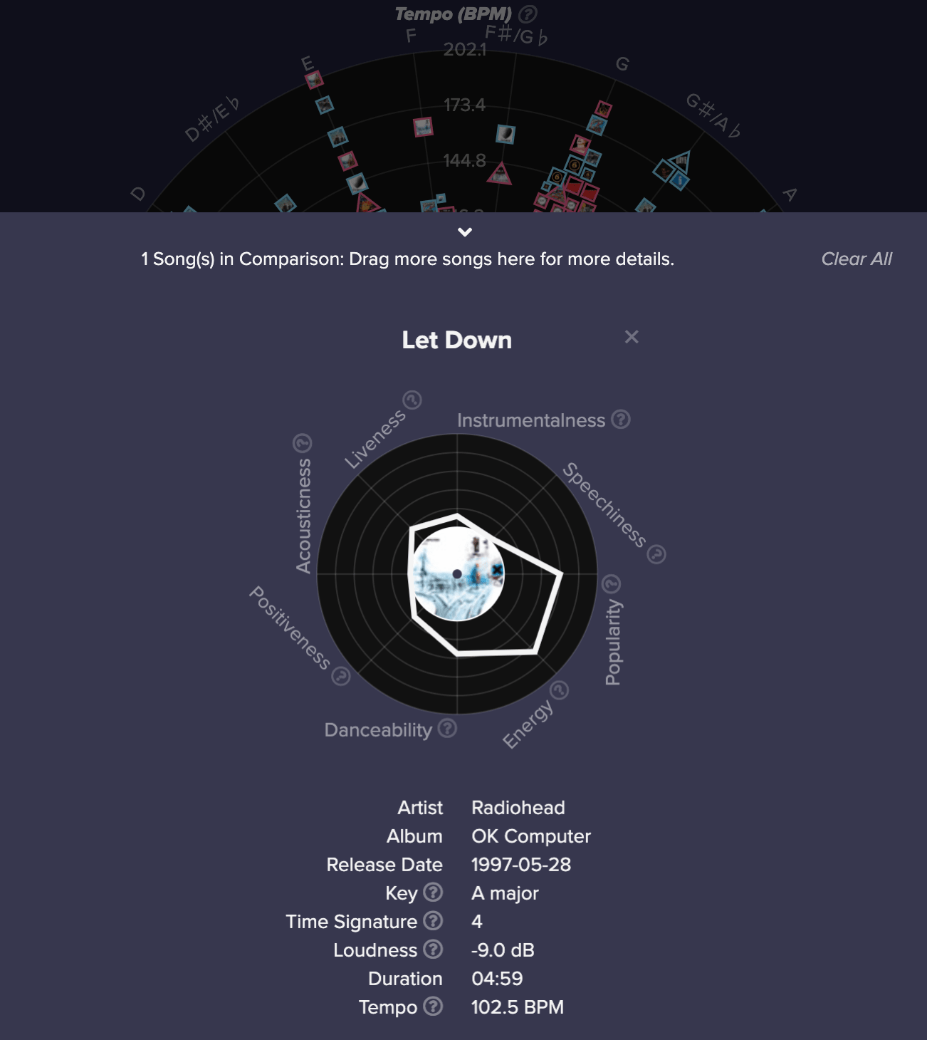
Users could select one song and drag it into the star view to gather more detailed information.
‘Hairball’ problem.
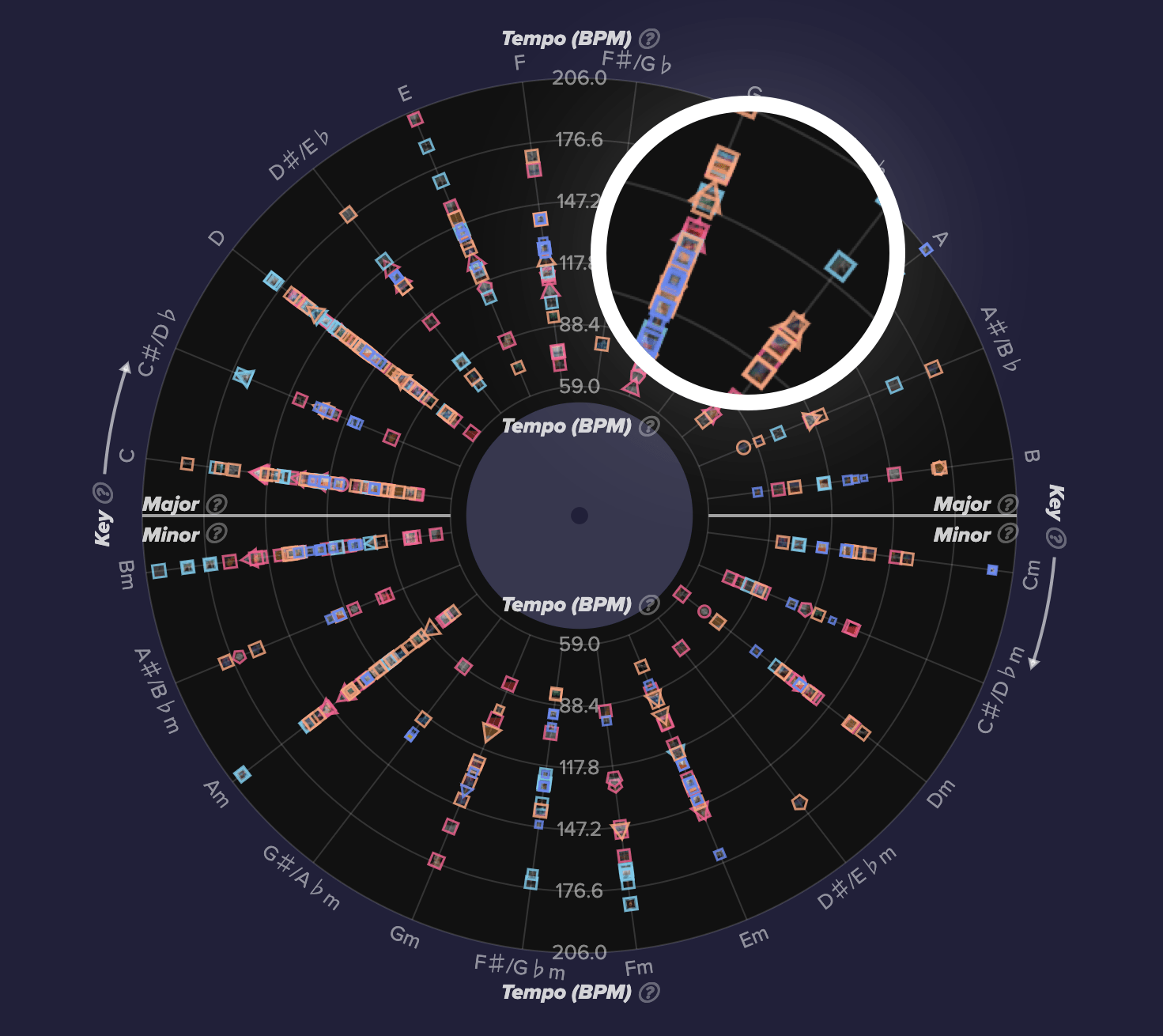
Before.
Many nodes clustered together.
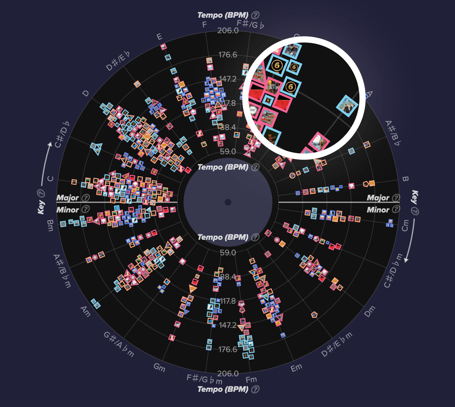
After.
Use spring model of force-directed algorithm to loosen nodes.
Informative.
Maximize data-ink ratio: Focus on data, eliminate background.
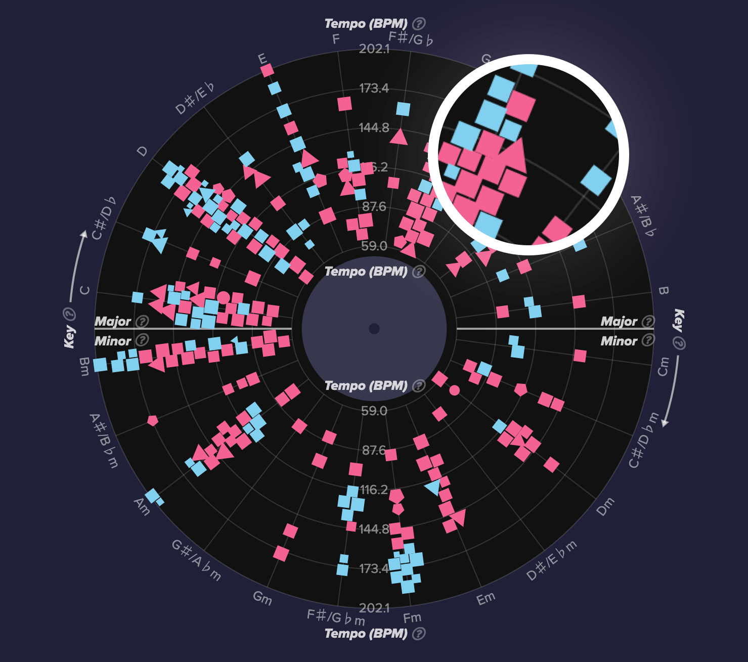
Before.
Each data point is one song. Use color to indicate different artists.
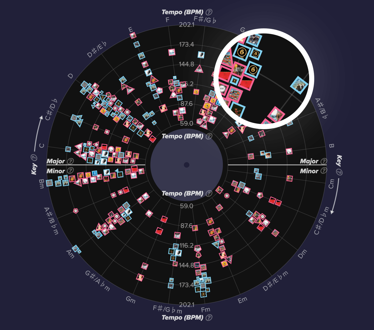
After.
The shape of the data point maps to time signature; the size represents the popularity. Instead of just using color, we add song’s cover photo to spur more insights of which album it’s from.
Information overload.
Design should be ‘boiled down’ and ‘simplified’.
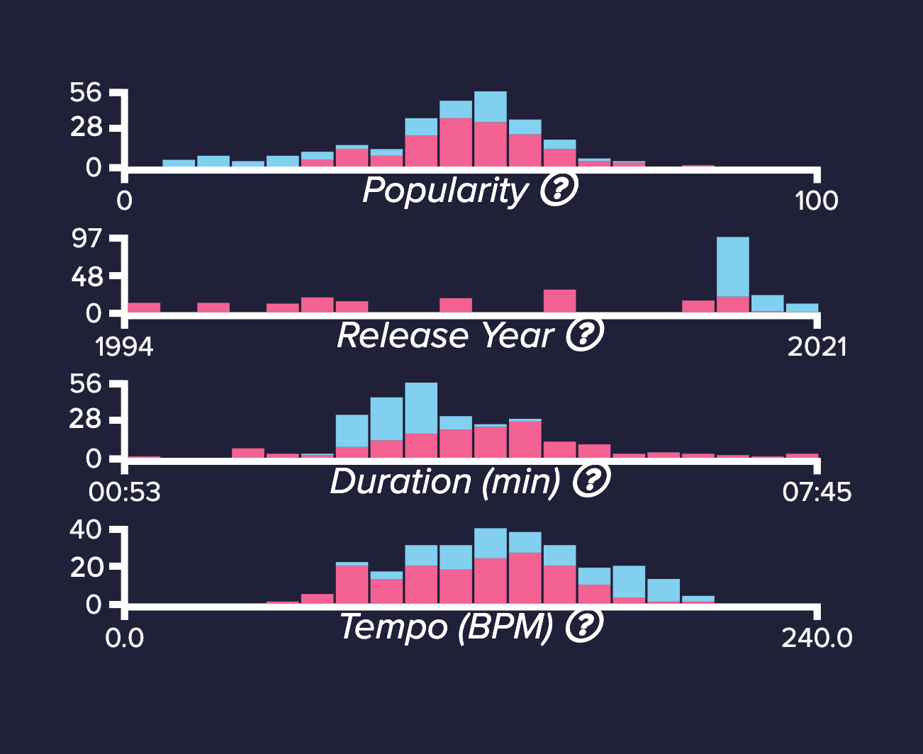
Before.
Use default bar view format.
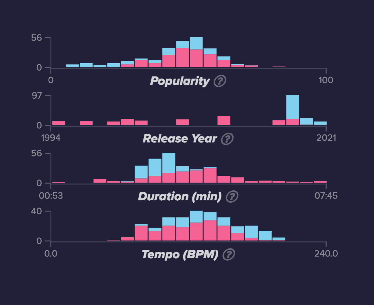
After.
Faded axises, eliminated numbers, etc to stress more of the key element - bars.
Interconnective.
Three main views - artist selection, vinyl view and bar view are interconnected. Once users hover one element in the view, the corresponding elements in other views will be highlighted.
“Interaction is the key that involves the dialog between the user and the system as the user explores the data set to uncover insights.”
Visual design.
Moodboard
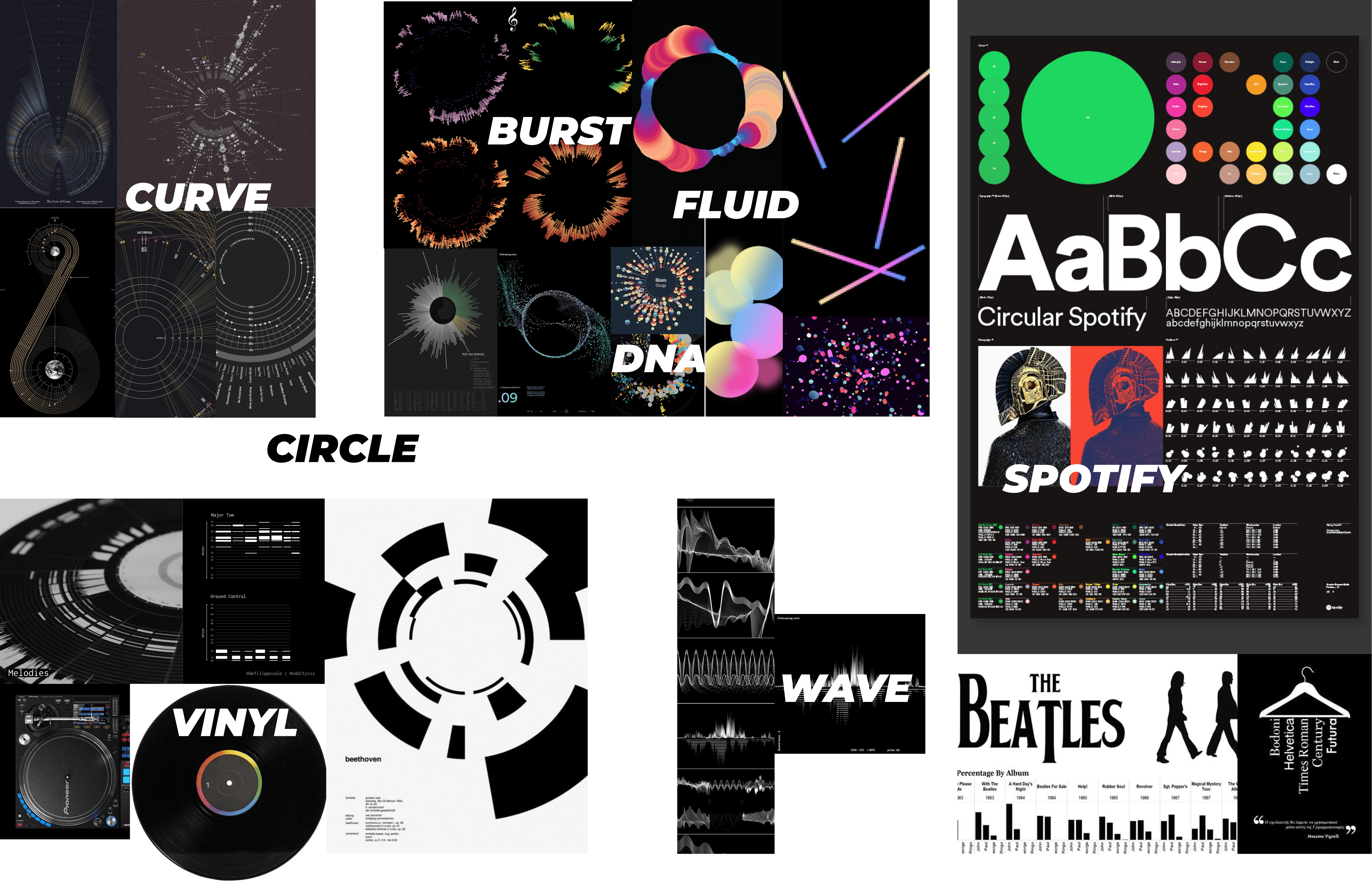
Color palette

Final design.
Guideline.
Compared to normal websites, visualization systems normally have multivariate dataset which means more complex visual representations and multiple visualization views. Apart from simplifying the dataset and the view, proper guidelines should be provided to reduce the cognitive effort.
When you first enter the landing page, you’ll see a quick tutorial explaining key visual representations. We also provide a step by step tutorial to walk you through the above main actions you can do. But whenever you need help, you can just click ‘how to read this vis’ to get more ideas of main interactions you can do.
How to read the visualization?
Artist comparison.
You could add your favorite artists for comparison. Different colors indicate different artists and you can hover one artist to highlight his / her songs. The main view conveys music attributes for each song. You could always change the axis to see other attributes, or group similar songs. You could click the ‘split view’ to even separate artists into different views - true music DNA.
How do Muse and Radiohead differ / similar with each other?
Song comparison.
When you hover over a song you’re interested in, it’ll play the song clip. On the right view of feature distributions, it’ll highlight the bin that contains this song for each song attribute. If you’re interested in more details of this song, you can always drag the song to the bottom to get a song-by-song comparison.
How do Supremacy and Survival by Muse differ / similar with each other?
Discover new music.
We calculate music similarity based on music attributes. Whenever you hover over a song, lines will be highlighted and point to other similar songs you might be interested in.
What are other songs I might be interested in based on what I like?
Previous
Social Eyes